Font Faux Pas
I guess some people get all riled up over a font. Who knew?
Well as it turns out
he was right. The fonts most commonly recommended for resumes are Arial, and
Times New Roman. Calibri, Bookman Old Style and Century are also mentioned.
These fonts are best for resumés because they are simple and easy to read.
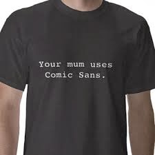
Comic Sans, as the name suggests, was a font that was originally designed for
use inside the word bubbles of comic strips. So, you can see why, if you want
someone to take you seriously, it would not be appropriate for your resumé.
Font choosing or
typography is a big deal. And a complicated one. The more you learn about the
choices available and the design elements involved the more you will question
your ability to create that yard sale sign or Christmas newsletter. Ignorance
is perhaps best. Just choose something cute and be done with it.
Or .... if you do want
to have some savvy in this area, there is a font of knowledge
available (notably the websites below). The most important tip that I have
found is that fonts are often compared to a wardrobe or a closet of clothes.
They contain outfits that are appropriate for some occasions but completely
wrong for others. So if you can make the right match you’ve got it made!


Comments
Post a Comment